
Responsive Design Essentials: Elevate Your User Experience with Best Practices
Responsive design isn’t just a trend; it’s an imperative in today’s varied digital landscape. In this concise guide, you’ll learn how to employ flexible layouts, media queries, and a mobile-first approach to ensure your website offers an optimal experience on any device.

Responsive design isn’t just a trend; it’s an imperative in today’s varied digital landscape. In this concise guide, you’ll learn how to employ flexible layouts, media queries, and a mobile-first approach to ensure your website offers an optimal experience on any device. Start building a universally compatible web presence now.
How a brand turns into digital visual identity
Ready to elevate your design strategy? Get this must-have book in ebook or print format. Packed with practical advice, it’s your roadmap to becoming an elite designer who thinks strategically and builds unforgettable brands.
Key Takeaways
- Responsive web design is crucial for a consistent user experience across different devices, using techniques like media queries, flexible grids, and fluid images to adapt to various screen sizes.
- Mobile-first design is key in the digital age, prioritizing content and interactive elements for small screens and enhancing the experience as screens get larger.
- Fine-tuning for responsiveness involves choosing content-based breakpoints, testing on multiple devices, optimizing images, implementing adaptable navigation patterns, balancing design with performance, and using advanced CSS and JavaScript.
Understanding Responsive Web Design
Imagine entering a room where the space adjusts itself to accommodate the number of people present. Sounds futuristic, doesn’t it? This is essentially what responsive web design does for your digital space. Inspired by responsive architectural design, it ensures a great user experience by adapting website content and structure to different screen sizes and devices. This involves techniques like media queries, flexible grids, and fluid images, which contribute to a design that transcends mere adjustments of screen resolutions and images.
It’s all about consistency, making sure users get a smooth experience, regardless of the device or screen size in use.
The Role of Media Queries
Media queries are like the secret sauce of responsive web design. These rules in CSS, which change how a website looks based on factors like screen size and device type, are incredibly versatile. They can pick up on media features such as:
- max-width
- device-width
- orientation
- color
Efficient use of media queries involves placing them all in one CSS stylesheet together with the rest of the site’s styles, thereby streamlining the entire responsive design process.
Flexible Grids and Fluid Images

The key to a website that perfectly adapts to different screen sizes lies in flexible grids, fluid images, and appropriate font size. Flexible grids work by using percentages for widths, ensuring that the layouts scale proportionally across different screen sizes. On the other hand, fluid images adjust to fit their container size, maintaining their proportions on different devices.
SVG files also play a significant role in responsive design. These lightweight vector files can be scaled infinitely without losing quality, making them ideal for non-photographic images.
Viewport Settings for Modern Browsers
In the realm of responsive web design, viewport settings play an unsung yet pivotal role. They dictate how a page appears and scales on varied devices, thereby ensuring a stellar user experience for all. Essentially, the meta viewport tag tells the browser how to handle the dimensions and scaling of the page, including the viewport width, providing an accessible and consistent user experience across devices.
Crafting a Mobile-First Strategy

In the digital realm, where mobile devices are quickly becoming the primary mode of internet access, prioritizing mobile design becomes crucial. Enter the mobile-first design strategy, which gives priority to mobile device experiences by designing for smaller screens first and progressively enhancing the experience for larger devices, ensuring a seamless mobile version.
We need to understand how to effectively prioritize content and interactive elements for mobile users.
Prioritizing Content for Mobile Users
When designing for mobile devices, the foremost concern is to deliver essential content and functionality. One way to accomplish this is by prioritizing content, which is all about strategically organizing and presenting information on a website to fit different screen sizes and device capabilities.
This involves pinpointing the most vital content and making deliberate design choices to prioritize user interaction on mobile devices.
Interactive Elements for Enhanced Mobile Interaction
Just as essential as the content is the way users interact with it. Incorporating interactive elements greatly enhances the mobile user experience. Some examples of interactive elements include:
- Touch gestures
- Device hardware features
- Interactive infographics
- Clean UI design
- Quizzes
- Surveys
- Forms
These elements can make the website more engaging, help users easily find what they need, and make browsing more fun.
Breakpoints and Browser Width Considerations
Breakpoints are the pivot points where a website design adapts to fit different screen sizes. They are crucial for making sure your designs work well on all kinds of devices. The selection of these breakpoints should be based on how content adjusts to its container, rather than targeting specific devices or screen sizes.
We need to understand how to select breakpoints based on content and the significance of testing across a variety of devices.
Selecting Breakpoints Based on Content
The choice of breakpoints should be dictated by content and not by the device. By testing the content to see where the breakpoints occur, we can ensure that the design adapts smoothly across different screen sizes. In fact, at some point, you might realize that you can predict breakpoints based on a device’s screen resolution.
Testing Across Multiple Devices
Testing across a variety of devices and screen sizes is an essential step in ensuring a seamless user experience. Modern browser developer tools, like Chrome’s Developer Tools, allow designers to simulate various devices and see how their design looks on different screen sizes, effectively utilizing screen real estate and adjusting to the screen width. By performing usability testing, designers can identify and resolve any issues that may arise during the user’s interaction with the design.
Emulators and simulators also come in handy to observe how the website behaves on different devices.
Optimizing Images for Responsive Contexts

Images can make or break a website’s performance. Therefore, optimizing images for responsive contexts is critical. Responsive images are designed to keep their quality no matter what size screen you’re looking at them on.
A deeper understanding is required of how the picture element, source sets, and art direction can be utilized for image optimization in a responsive context.
The Picture Element and Source Sets
The picture element and source sets are powerful tools for enhancing image responsiveness. The picture element allows for multiple image versions, letting the browser pick the best version based on the device’s screen size and resolution, allowing you to serve the appropriate image resolution based on the user’s device.
Art Direction with Responsive Images
Art direction plays a crucial role in optimizing images for different screen sizes. It involves adjusting or cropping images in different ways depending on the layout or screen size to improve the user experience. Techniques for cropping images include splitting the image into grids and aligning elements on the grid lines, as well as using center cropping to preserve the center of the image.
Navigational Patterns for Responsive Websites
Navigational patterns are the crux of an intuitive, user-friendly website. In responsive web design, it’s crucial to implement navigational patterns that adapt to various screen sizes and devices while maintaining usability and accessibility.
We need to better understand hamburger menus, hidden content, off-canvas navigation, and progressive disclosure.
Hamburger Menus and Hidden Content
The hamburger menu is a slide-out navigation menu that pops up when you click on the three-line menu icon. By hiding the menu, it allows you to make the most of your screen space. Moreover, hiding certain elements, like navigation menus, that might take up too much space on the screen, can make the interface look cleaner and less cluttered.
Off-Canvas Navigation and Progressive Disclosure
Off-canvas navigation and progressive disclosure are powerful techniques for revealing additional content and functionality as needed. Off-canvas navigation hides navigation menus or content off-screen and reveals them when needed, making the most of the screen space on smaller devices.
On the other hand, progressive disclosure is all about preventing users from feeling overwhelmed by slowly revealing information, showing only the essentials.
Balancing Performance and Aesthetics
In responsive web design, striking a balance between performance and aesthetics is crucial. It’s about ensuring your website not only looks good but also performs optimally. This involves minimizing HTTP requests and adopting a minimalist design approach.
We need to understand more about minimizing HTTP requests and the advantages of embracing a minimalist design approach.
Minimizing HTTP Requests
Reducing the number of HTTP requests can significantly improve page load times. This can be achieved by combining files, using CSS sprites, and optimizing images. File combining, for example, involves putting together a bunch of similar files, like JavaScript or CSS files, into one single file, which reduces the number of HTTP requests, leading to faster loading web pages.
Adopting a Minimalist Design Approach

Embracing minimalism in design can create clean, efficient, and visually appealing interfaces across all devices. The key principles of minimalist design include:
- Simplicity
- Clarity
- Whitespace
- Emphasis on content
- Focus on what’s important
Minimalist design helps make web pages load faster by cutting down on file sizes, reducing HTTP requests, and creating a cleaner and more efficient design.
Leveraging Advanced CSS and JavaScript Techniques
Advanced CSS and JavaScript techniques can greatly enhance the responsiveness of a website. Techniques such as CSS Flexbox and Grid layouts, and enhancing responsiveness with JavaScript are becoming increasingly important in today’s web development landscape.
We need to understand how to use CSS Flexbox and Grid layouts effectively, and how to improve responsiveness with JavaScript.
CSS Flexbox and Grid Layouts
CSS Flexbox and Grid layouts provide powerful tools for creating flexible, adaptive layouts. CSS Flexbox allows for the arrangement of items in rows or columns, ensuring that the layouts scale proportionally across different screen sizes.
On the other hand, CSS Grid creates a flexible grid for webpage elements, allowing them to adjust to the available space.
Enhancing Responsiveness with JavaScript
JavaScript not only adds interactivity to websites but also enhances their responsiveness. It works alongside CSS media queries by paying attention to changes in the viewport size or other measurable factors, then applies or updates styles dynamically based on those changes.
This collaboration results in a more interactive and responsive user experience.
Case studies: responsive design in practice
As always with responsive design, it is worth learning from the experiences of others and avoiding potential pitfalls. By analysing short case studies of successful responsive design, you can gain insights into effective design techniques.
Analyze the responsive strategies used by industry leaders and lessons learned from responsive redesigns.
Analysis of the res responsive design strategies to follow
Almost without exception, market leaders are applying responsive design strategies based on best practices. If you look at the website of Nike, Apple, Google or any global market leader, you will be greeted by a responsive website.
It's worth looking at some market-leading but less trite examples. There is a lot to learn from them.
Shopify and responsive website building
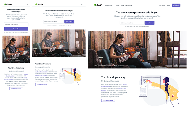
The Shopify user experience is consistent across all devices. The only differences between desktop and mobile are the call to action button and the placement of illustrations.
As with most websites, Shopify's menu is replaced with a hamburger icon on mobile devices.
This is what responsive web design looks like on Slack

The Slack brand's brand personality is based on being simple and human. Not surprisingly, their website follows the same guidelines.
Their flexible grid easily adapts to different sizes and shapes of viewports. For example, while client logos appear in a three-column layout on desktop and laptop computers, they appear in a single column layout on handheld devices.
Dropbox's responsive efforts

Dropbox has done an excellent job of adapting its website to smaller devices. The desktop version boasts an elegant aesthetic, with the grid and image colours complementing each other.
Not only does the font color change to match the background color when switching between desktop and portable devices, but the image also changes orientation.
Taking context into account, Dropbox offers a personalised experience across all devices. For example, to prevent users from jumping, a small arrow directs desktop users to scroll down to view more content.
The same arrow is missing on portable devices, as it is assumed that users naturally scroll on touchscreen devices. Similarly, their registration form is visible on desktop devices, but is hidden behind a call to action button on tablets and mobile devices where space is limited.
These examples can provide valuable insights into effective responsive design techniques.Summary
In this journey through the world of responsive web design, we’ve delved into the mechanics of responsive design, explored strategies for mobile-first design, understood the importance of optimizing images, analyzed navigational patterns, balanced performance and aesthetics, and leveraged advanced CSS and JavaScript techniques. We also took a look at case studies of successful responsive designs, learning from industry leaders and successful redesigns. The key takeaway? A responsive design is not just about making a website look good on all devices, but also about ensuring a seamless and user-friendly experience.
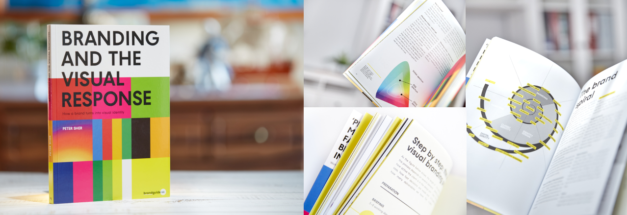
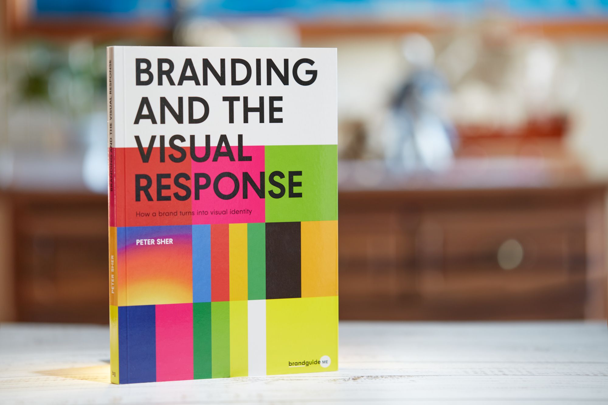
How a brand turns into visual identity
Ready to elevate your design strategy? Get this must-have book in ebook or print format. Packed with practical advice, it’s your roadmap to becoming an elite designer who thinks strategically and builds unforgettable brands.
Frequently Asked Questions
What is meant by responsive design?
Responsive design means designing websites to adapt to a user's device, ensuring optimal usability and appearance regardless of the device being used. This approach aims to make web pages render well on a variety of devices and screen sizes.
What are examples of responsive design?
Responsive design examples include Dropbox, which adapts its web page to different screen sizes, demonstrating the impact of responsive UX design on user behavior. The web pages vary based on the device used, showcasing the versatility of responsive design.
What are the three main elements of responsive design?
The three main elements of responsive design are the media query, the web browser, and the responsive web interface.
What is mobile friendly design?
Mobile-friendly design means creating websites that adapt seamlessly to different screen sizes and devices, providing a better viewing experience on mobile devices due to their smaller screens.
How can I minimize HTTP requests to improve my website’s performance?
To minimize HTTP requests and improve your website's performance, you can shrink image size, condense and bundle code, use lazy loading and caching, and optimize images.
Visit our resources page, it provides you a free PDF guide to learn — and perhaps use it in your next project, adding value to your services, or by our book which is a step by step guide to branding 👇
How a brand turns into visual identity
Ready to elevate your design strategy? Get this must-have book in ebook or print format. Packed with practical advice, it’s your roadmap to becoming an elite designer who thinks strategically and builds unforgettable brands.