
OMV's new image - brand analysis
OMV is launching a new identity to visually reflect its transformation into a sustainable, integrated chemicals and energy company. The new logo features a modern, linear design with a green symbol representing continuous movement and forward thinking.

We can expect another streetscape change in our countries: this time in the area of petrol stations. Previously, the Polish company Orlen has made a strong appearance in red, and now the Austrian OMV is set to make a change.

OMV is launching a new identity to visually reflect its transformation into a sustainable, integrated chemicals and energy company. The new logo features a modern, linear design with a green symbol representing continuous movement and forward thinking. The rebranding has been developed in collaboration with Interbrand and will be gradually rolled out across all B2B and B2C touchpoints. The change emphasises OMV's focus on sustainability and the circular economy.
Interestingly, the OMV branding will be radically changed: from the unique OMV logo, which has been repeated twice, to a single symbol.
But let's not get ahead too quickly. Let's find out what OMV is!
About OMV
OMV AG, the Austrian oil, gas and petrochemicals group, is getting a new image. The company wants to visually express its planned transformation from an oil and gas group into an integrated, sustainable chemicals, fuels and energy company.
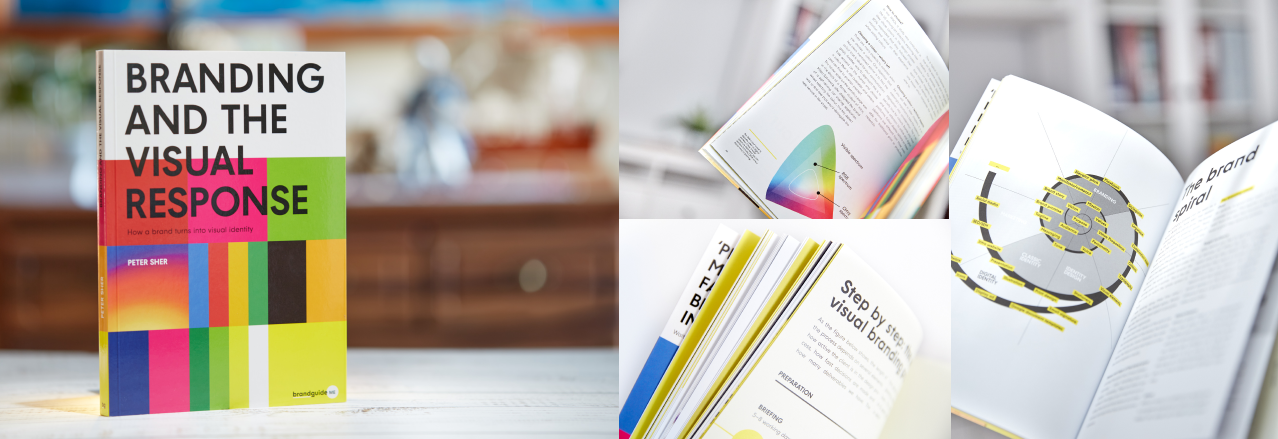
How a brand turns into visual identity
Ready to elevate your design strategy? Get this must-have book in ebook or print format. Packed with practical advice, it’s your roadmap to becoming an elite designer who thinks strategically and builds unforgettable brands.
OMV was founded in 1956 as "Österreichische Mineralölverwaltung Aktiengesellschaft" (ÖMV). In the process of internationalisation, the group name ÖMV was changed to OMV in 1995. Among other things, the company operates around 1,700 service stations in eight European countries. In terms of turnover, OMV is the largest company in Austria. OMV is also one of Austria's largest emitters.
The company aims to become climate neutral along the entire value chain by 2050.
After almost 30 years, the two-line OMV logo is now giving way to a completely new logo.

Let's look at the past
Flashback: in 1985, the company introduced a blue logo. During the gradual internationalisation process, in 1995, the sometimes difficult-to-decipher logo, consisting of basic geometric shapes, was supplemented by the "OMV" logo in a neutral font.

How is the new one?
The logo, which has just been unveiled at an investor event, has a linear design and a classic/conventional structure, consisting of a figurative sign followed by a caption. The wordmark is still in capital letters, but in a fatter font than before.
The company says the new logo embodies OMV's focus on sustainability and the circular economy.

Blue and green remain the main identity colours. In the future, these will be complemented by the violet-purple colour scale (see figure). The company will use the OMV Progress unique font as its corporate font.
The new branding will be gradually rolled out across all OMV B2B and B2C touchpoints, including around 1,000 OMV service stations in seven countries.
The new brand strategy and identity have been developed in collaboration with Interbrand.
The brandguide opinion
I've long wondered why the redundant OMV / OMV inscription is in the OMV logo. We don't have an answer to that now, but at least I will see it less often and wonder about it. If you have any tips, I'd be happy to take the cause of the redundancy.
On the rebranding, it is clear that this is a radical change: a change of image, induced by the roots of the business, and a message that this OMV is not the same as it was before.

That required a radical, forward-looking change, which in fact means that everything has changed.
The sign is perfectly in sync with this change, and tells the story of the brand strategy in an almost didactic way: constant forward thinking, innovation and the importance of the circular economy.
The result is an understandable, likeable sign that is extremely flexible to use and shape.
In line with the demands of the age, the new OMV brand does not set out a rigid set of rules for appearance, but provides a framework in which distinctive brand elements can be flexibly combined to create a unified OMV image. This works well in the brand book, we will see in real life if it manages to remain distinctive.

The change in colour is also a step forward. The basic colours have been retained but updated, and the way they are used gives the brand a freshness. The bright colours work very well on digital touchpoints. The question is how the RGB to CMYK conversion will solve the issue on physical touchpoints, especially on signs and stickers in petrol stations. The primary plans don't seem to have addressed this yet, I've only found digital "rebranding" of the earlier wells, which I can see the potential for refinement.

It will be interesting to watch the trend and see at what pace the classic fossil based mega oil companies will follow OMV, as this move is a must for all of them already in the medium term.
OMV has given a strong signal with this rebranding, and I think the move we are seeing is not only visually good.
If you would like recieve more content like this, sign up for regular updates and might be worth checking my latest book on branding 👇
How a brand turns into visual identity
Ready to elevate your design strategy? Get this must-have book in ebook or print format. Packed with practical advice, it’s your roadmap to becoming an elite designer who thinks strategically and builds unforgettable brands.